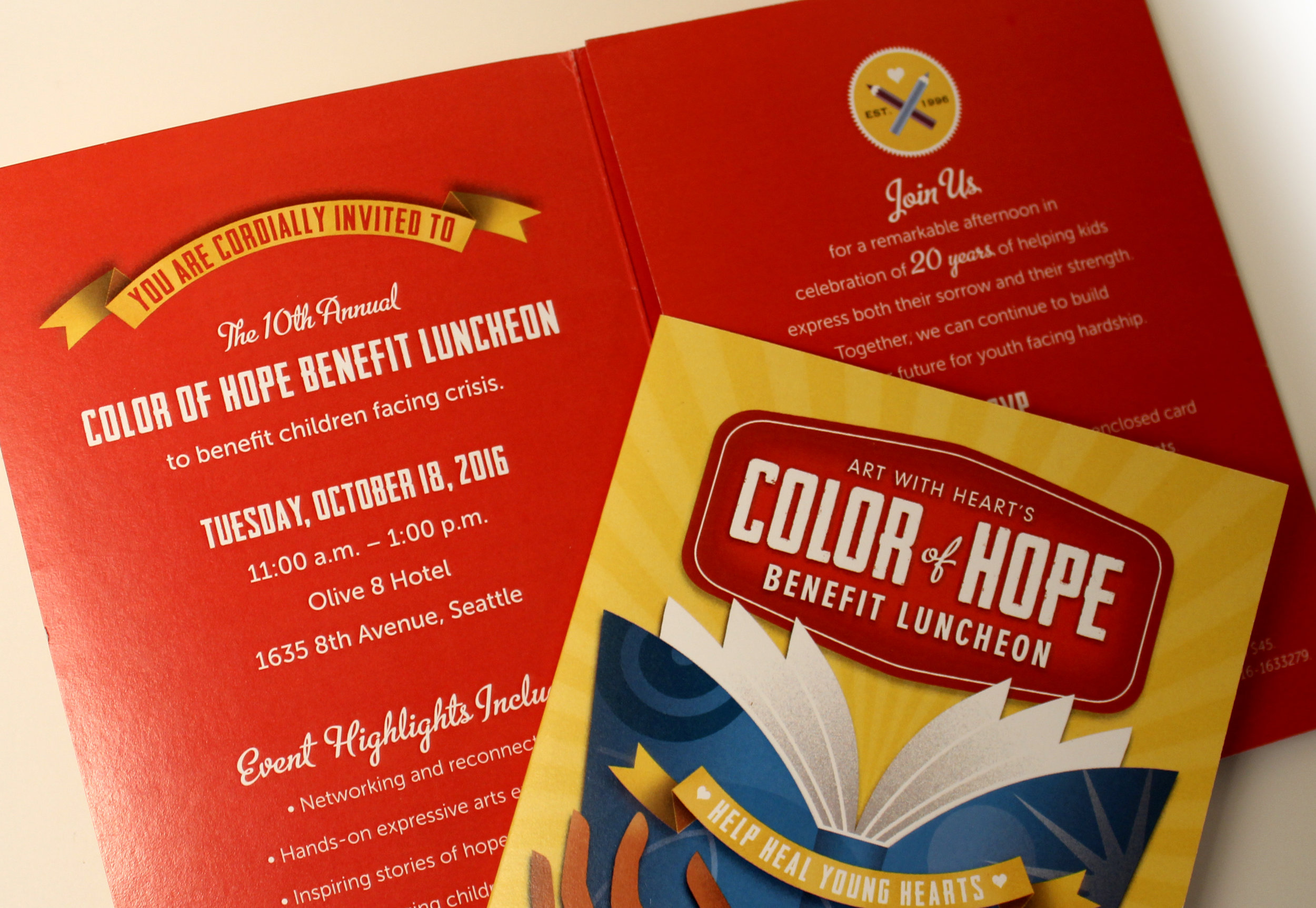
ART WITH HEART’S COLOR OF HOPE EVENT
How can we reinvigorate interest in our yearly benefit luncheon?
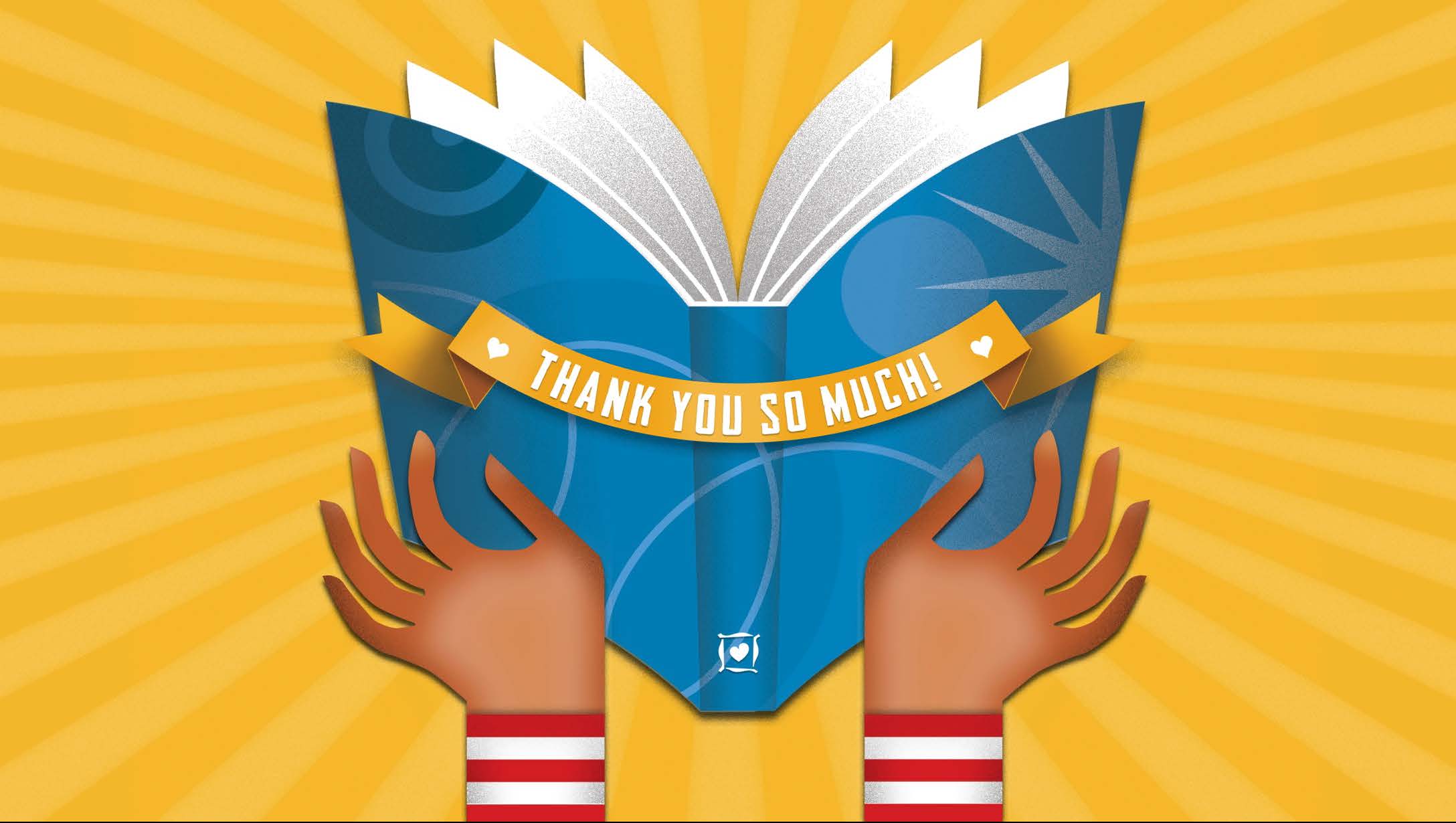
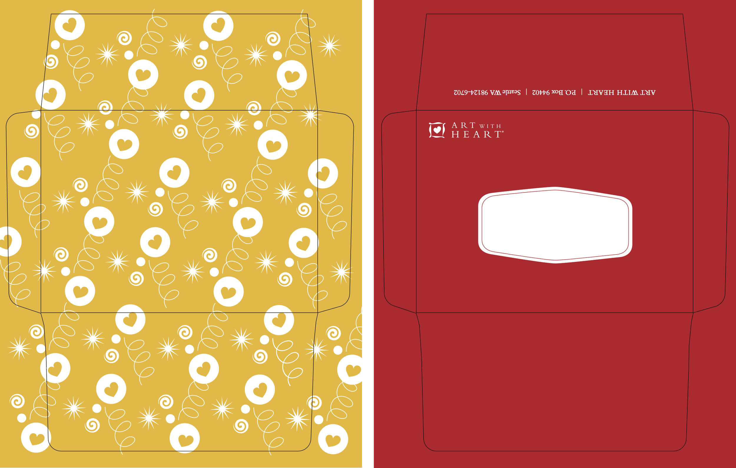
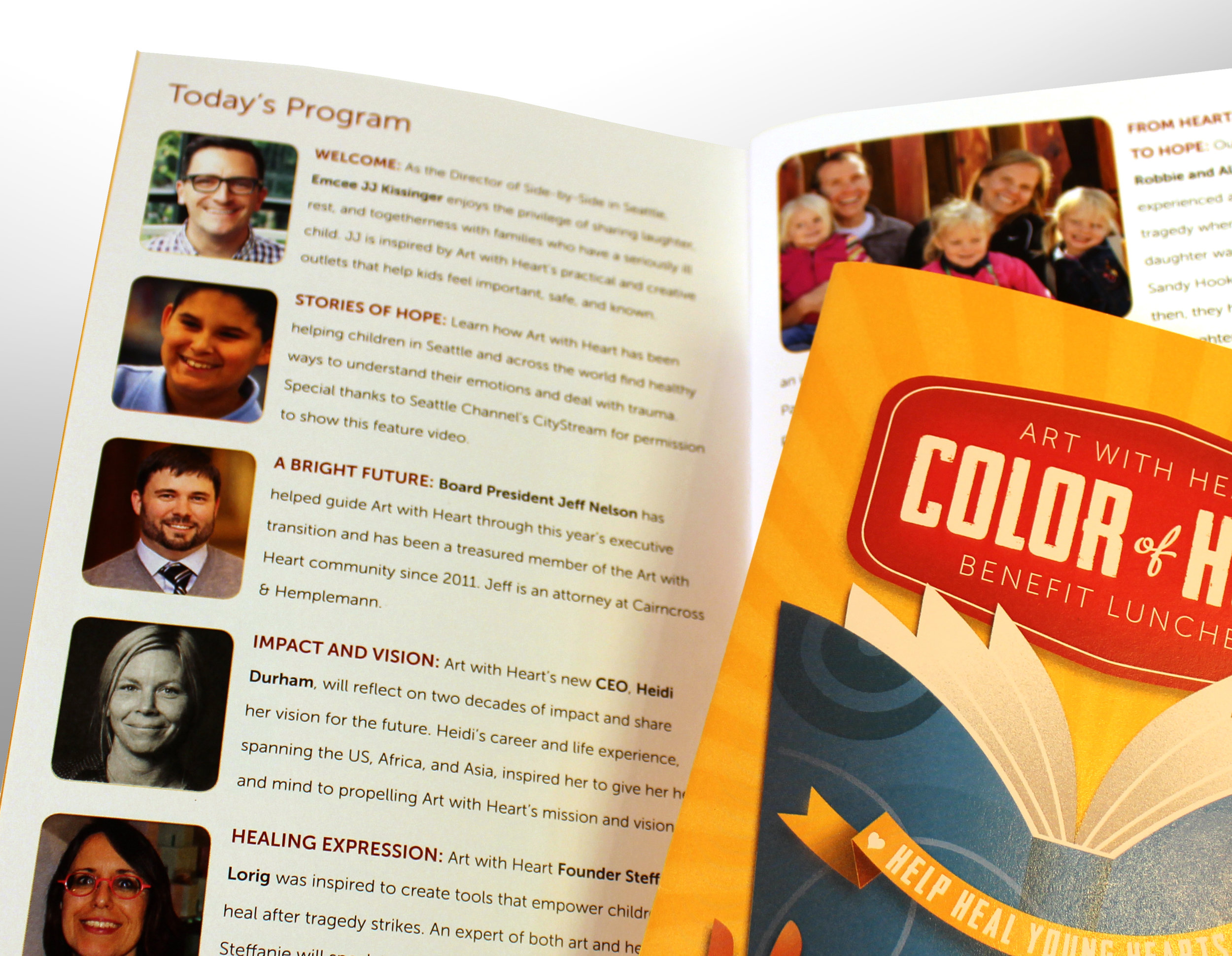
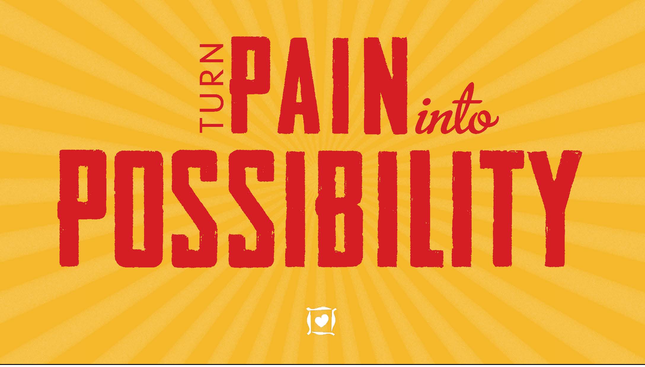
The creative challenge was to communicate that the event benefited children using the arts and the healing power of Art with Heart's books. The organization had not printed invitations for years, and so the group wanted to get noticed again by past supporters.
The Process
Concept Development: In order to attract a wide audience, the design had to not lean too feminine or masculine, and it needed to be reflective of the organizations's 20 year history. So, I set out to find illustrator to take on the project pro bono. I sketched out concepts and contacted several who I felt captured the essence of the spirit the group wished to convey.
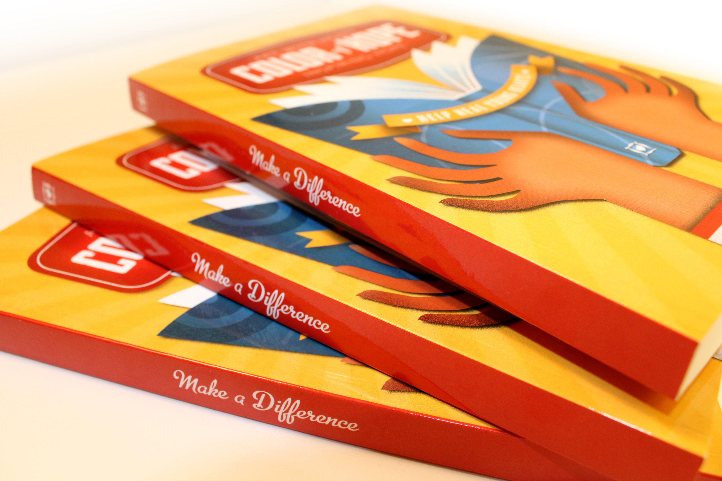
Illustration: Unable to find anyone who could take the job on within the scheduled due date, I decided to tackle it myself. This WPA style was not new to me and was something I knew I could do well.
Design: The design had to feel special but not too fussy. The timeline was tight and now I was doing both the design and the illustration. I worked closely with the event staff to keep them briefed and involved, allowing them to have opportunities to give input and make changes so they would feel totally comfortable with the changes from the year before.
The Result
The event was highly successful on multiple levels, and created a renewed energy between the attendees and the organization that continued well beyond that day and multiplied into additional interest.
MY ROLE: Creative Director, illustrator